“NaNoDeMo”

Some particularly ambitious people take part in a yearly event called NaNoWriMo (National Novel Writing Month), wherein they write an entire novel during the month of November. Think “quantity-over-quality” as a creative exercise taken to the extreme.

I don’t want to do that, but I do love the idea of pushing myself creatively. So I made up NaNoDeMo: National Novel Design Month. It turns out I like giving myself dumb things to work on all month.

Read more

Inktober

The theme for the year seems to have been intense, month-long projects designed to push myself creatively. In October, I participated in #Inktober, which challenges participants to draw something with ink every day.

I originally intended to do some monolithic theme, with thirty drawings exploring a single physical location—an imaginary motel—but ended up just kind of going with it. For some I used a brush pen and limited myself to a minute or two, others I inked with technical pens and colored meticulously in Photoshop.

It was a really delightful project, and I’m glad I did it. I have no idea if I’ll do it again next year, but I’m happy to report I’ve already been drawing more in the 1.5 months since I finished.

Read more

Home

home-power-lines

My parents are moving away from the house I grew up in, so I’m working extra hard to document it before the ink dries. This will be an ongoing series.

Graphic Design for Non-Designers

2.1 - Why design-

This past Monday I had the absolute pleasure of presenting a workshop at SXSW Interactive 2016 with my friend Jess Warren. We had a packed house (about 100 people) for our workshop on the basics of graphic design, targeted to people who had no background in design but could benefit from some basic design skills (hint: that’s pretty much everyone).

It was a lot of work but had a huge payoff — I know Jess and I both had a great time and we received some awesome feedback. You can find the slides on Slideshare if you’re into that sort of thing.

As a couple of footnotes for those of you who attended the session, I recommended the following two resources for those wishing to learn more about Typography: Butterick’s Practical Typography and The Elements of Typographic Style. As always, if you want to talk shop please do get in touch.

Food Photography on Location

Lately I’ve had the pleasure of shooting some local restaurant fare here in the Dallas area. I’ve always loved shooting food (probably because I just love food) and it presents some really interesting challenges. Every dish offers something different, and often the most delicious dishes are challenging to photograph in an attractive and appetizing way.

P1000632

It’s also more than just photography — being sent on assignment with food means you get to play art director and food stylist as well. I carry a pair of tweezers and a small knife to ensure nothing’s out of place, and use a napkin to take care of any stray sauces or smudges on the plate. A little spritz bottle of water can help liven up greens and sliced fruit to make them glisten.

Scallops

With food you’re also presented with a lot of variables, like what kind of lighting to expect. I try to set up shop next to a window but that’s just not always possible. Utilizing the restaurant’s ambient lighting can help bring a bit of the atmosphere into the food in ways that using a flash just can’t capture.

P1000616

Sometimes trying to get food to look perfect gets in the way of making it look good; comfort food, for example, sometimes just needs to look how it looks. It can be a little messy.

luckys-cafe--8

The preceding images were shot for Favor. You can see more of my editorial photography here.

Lately

Mismatched forks

∗ ∗ ∗

What have you been up to? Let’s talk about it.


Home

OLYMPUS DIGITAL CAMERA

I long, as does every human being, to be at home wherever I find myself.
— Maya Angelou

One Hour With “One Hour Photo”

Photo-Jul-22,-9-53-24-PM Photo-Jul-22,-9-53-32-PM


One Hour Photo” is a new photography app for iPhone. The idea is simple (and I must admit I scoffed at it at first): You take pictures with the app, which has virtually no settings at all (it’s very much like shooting with a disposable camera or something). The screen turns white for a split-second. Then a timer starts at the bottom of the app, and the viewfinder reappears. The photos show up in your camera roll an hour later, with a dreamy black-and-white “film” filter.

There’s something very zen about the whole experience. It quite literally takes away my usual perfectionism and attention to detail and makes me take photos of moments and let them pass. I spent my dinner break last night driving / walking around in Austin snapping photos, and I really enjoyed it. Something about the format — the anticipation, the not-looking-back, and perhaps most importantly the lack of immediately firing up any number of editing apps — made me really enjoy just pointing my phone at things and shooting. I really can’t recommend it strongly enough. Almost as an added bonus, the app has some of the most convincing faux-film effects of any app I’ve ever used, and it does so completely automatically.

Photo-Jul-22,-9-53-22-PMPhoto-Jul-22,-9-53-27-PM Photo-Jul-22,-9-53-26-PMPhoto-Jul-22,-9-53-30-PM

Mapping Transit in Tulsa, Oklahoma

2014-07-14_2132

Two years ago, while riding a city bus in Tulsa, I had a thought.

I’d been riding the bus off and on for a while. The service itself was really great — the buses ran on time, were generally clean, affordable, the drivers friendly. I was, however, consistently frustrated by basically every element of the graphics, maps, signage, branding and various printed schedules — and don’t get me started on their website (it’s since been updated, apparently using web standards from the late nineties).  The buses almost always went where I needed to go, but finding my way there via their maps and schedules was quite a challenge. People who rode often had a sort of route memory, and it’s easy to see why they needed to. Consulting the map was a source of endless frustration.

I’m a lover of transit design. The first time I saw a Massimo Vignelli NYC subway sign, I had someone take my picture with it. I was once given a transit map shower curtain as a housewarming gift, and I have a drawer full of maps from every city I’ve visited. I’ve always wanted to design a map, but never knew where to start. Then I read a newspaper on a bus (I’m a regular well-respected man-about-town, apparently) and came upon an article about a light rail proposal. Tulsa’s always proposing light rail. I love trains, but I suspect it would be a disaster, but that’s another post. I started thinking about what the wayfinding might look like on a Tulsa Train system. And I thought of the bus map, and I got sad.

And then I got excited.

5eb3114ecec811e192a022000a1d0114_7I got home and spent all evening sketching, doing research, completely re-thinking the transit system of my home city. What if there were Rapid Bus (BRT) corridors? A commuter rail system serving the suburbs and the awkwardly located airport? My mind was buzzing.

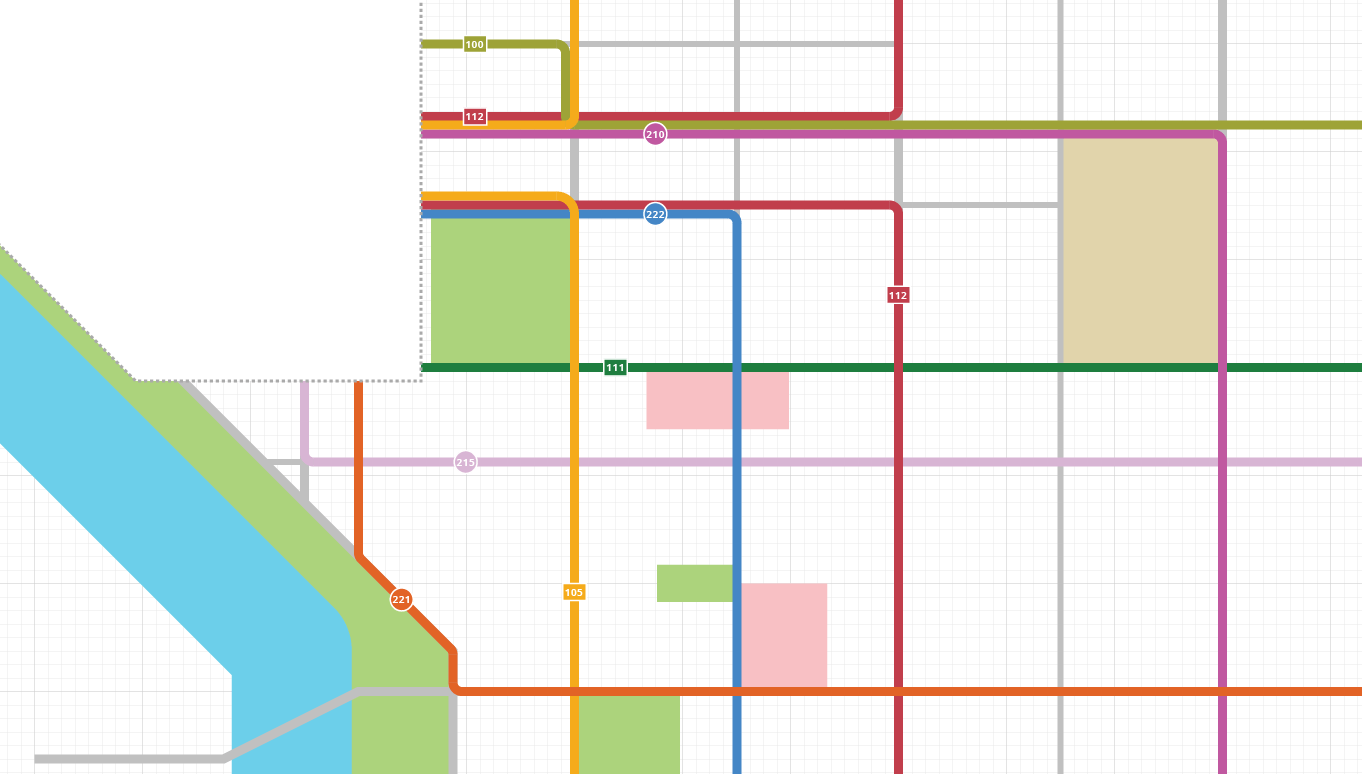
Over the coming days as I continued to work on this project, the scope intensified. While originally I wanted to plot theoretical new lines and rail service corridors as a kind of de facto Urban Planning exercise, it became clear that information design was the core of what I was after. I couldn’t do anything else until I had a solid core, building upon the existing service.

And so, two years ago on Friday, I started this project. Then I got busy with life and freelance work. Then I moved to Austin. I was pushing my pet project on down the road and making excuses. Lately I’ve been thinking about it again, and I’m committed to finishing it this summer.

I’ve been making progress. If you’d like to follow along, check out Transit Tulsa, a tumblr where I’ve been posting status updates and talking about what I’ve learned.

2014-07-14_2136